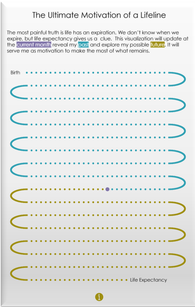
The Ultimate Motivation of a Lifeline .|: A Tableau Visualization Tutorial
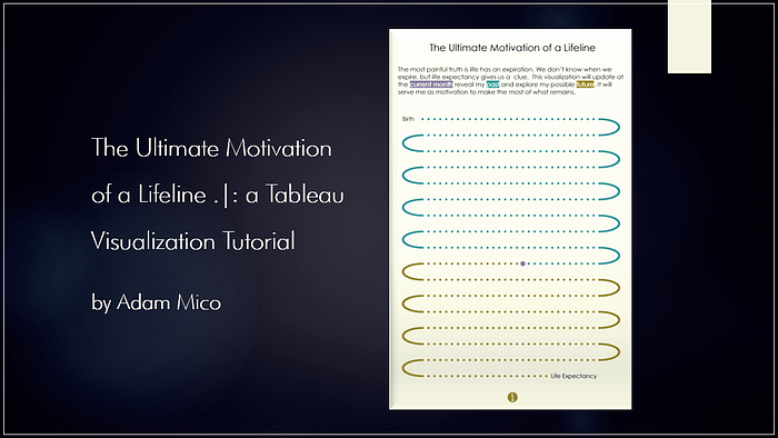
A couple of weeks ago, I was browsing blogs and came across “How to Visualize the Rest of Your Life” by Dr. Gregor Scheithauer (Twitter | Blog) via Towards Data Science. At 1st, it saddened me as it made me contemplate my own mortality. However, that despondency quickly shifted to inspiration. Reading through this, I knew I could do this in Tableau, and the data preparation and research were straightforward.
Research
Fortunately, the US Social Security Administration has a handy dandy calculator to determine longevity. It looks at your gender, date of birth, and current age. Plugging in your gender and date of birth determines how much additional time you can “reasonably expect to live.”. Again, a little morbid, but super helpful when preparing the data. Based on their calculation, it’s estimated that I will live until I’m 81.7 years of age.
Data Collection
My goal for the data in the visualization was to have a simple data connection with Tableau, so it can update automatically. Tableau Public works with Google Sheets, and a user can instruct the visualization to connect with the data automatically. Typically, Tableau Public requests an update daily from the connected Google Sheet.
Directions
- Select “File” and “Make a Copy” to access your datasheet.
- Edit Cell “A2” with your birthdate.
Note: The only cell you would edit is A2 with your birth date. The rest of the table will auto-calculate the week number, age, month (really year and month with leading zeros), week label, and age label.
3. Drag fields down if your life expectancy is expected to be longer than 81.7 years or remove rows if it is expected to be less.
Note: Use the “Age” field to determine when your life expectancy years are met.
4. Make sure to rename and save the sheet.
Data Tip: I strongly encourage anyone, when approrpriate, to build calculations in the data source. Although Tableau has great calculation functionality, it’s most efficiently utilized when you can use it to focus on visualization rather than creating extra calculations that can be applied to the data source. This is even more relevant when using larger data sources and performance needs extra consideration.
Tableau Time
At 1st, I considered using a chart similar to Dr. Gregor. Subsequently, I found out (thanks to Jeffrey Shaffer (Twitter | Site)) a similar version was done years ago by the legendary Joe Mako (Twitter)… reference tweet).
Appropriately, The Beatles’ “The Long and Winding Road” played on shuffle recently and immediately thought this would work as a curvy timeline. Next, I considered Ken Flerlage’s (Twitter | Blog) awesome Curvy Timeline tutorial. Still, I went with Toan Hoang’s (Twitter | Blog) Creating Path Charts in Tableau because I used it before and knew the calculations were super flexible and with so many marks needed the flexibility.
I quickly wireframed the visualization in PowerPoint and knew I did not want a large viz and more tall than wide. The chart would cover a little more than 70% of the height and nearly all of the width.
Tip: This is a good time to select Toan Hoang’s Creating Path Charts in Tableau.
Using Toan’s tutorial as is, was almost everything I wanted with the layout. I experimented with the spacing and curve distance and settled at ‘20’ curve distance and ‘6’ spacing.
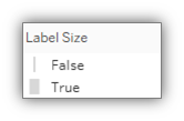
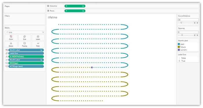
Since there was a little more to this visualization than the tutorial, I needed to work it out. While working it out, I wanted to make the current month larger than the other months, so I made a simple true-false calculation in Tableau (this is the only Tableau calculation field beside the calcs in Toan Hoang’s Tutorial):
Label Size (field name)
[Month Label]=”Current”
In my ‘Marks’ section, I colored by “Month Label,” sized by the new ‘Label Size’ calculation, made Month(Date) a continuous dimension (green), added MAX(Age) (continuous) and ATTR(age label), and made a line chart with “Month Label” defining the path.
Now to the X (columns) and Y (rows)…
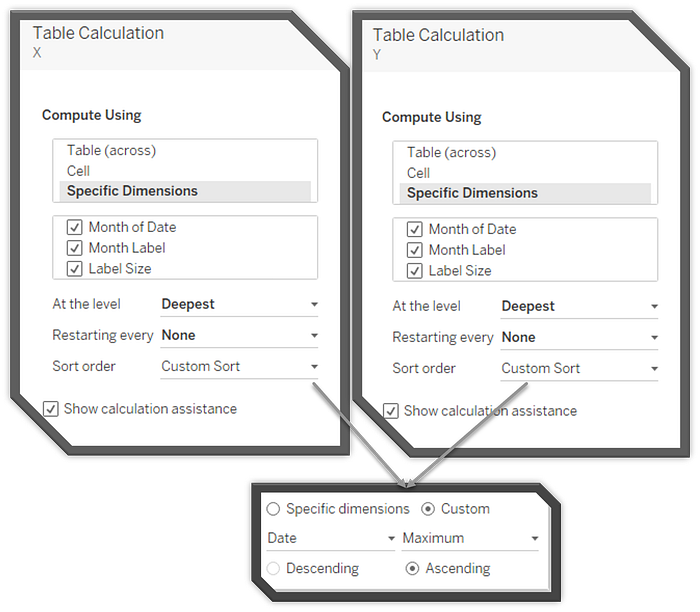
- You will need to make sure to define by specific dimensions by “Month of Date,” “Month Label,” and “Label Size” for both the X calculation and the “Y” calculation (see image below).
- To sort from earliest date to latest date, use custom sort and then select Date “Maximum” (so it doesn’t sum) and select “Ascending” (see below).
Note: If you wanted to reverse it, just select “Descending.”
Fine-tuning the chart
- Remove the lines as Toan indicated in his tutorial.
- Verify “Label Size” ‘True’ is larger than “False.”
Tip: If you double click (see the image below), you can manually modify the mark size range quickly.
3. Tooltip work. There is nothing worse than seeing a tooltip without a little TLC. Although this is an infographic visualization, it’s still super helpful to form tooltips as sentences to help enhance understanding of hovering over a dot.
Here’s a tooltip tip: For example, I used the “age label” from the Google Sheet to automatically update tense dynamically based on whether the month is a past month, current month, or future month. Here is the simple tooltip I created to help inform users hovering over a dot:

Once Complete, your sheet should look something like this:
Finishing the Dashboard
When I wireframed the dashboard, I wanted it to focus on the timeline. It was also important to word it so that it doesn't come off as morbid because that wasn’t the intended takeaway. Here was my quick wireframe:
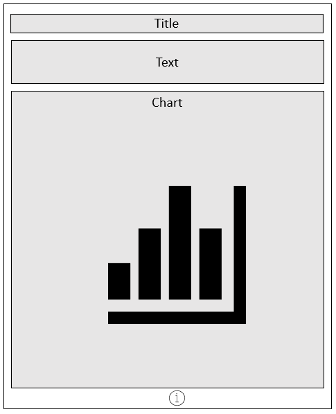
The visualization would highlight the chart while using a little whitespace and wording it to tell the desired story.
When I work with Tableau infographics, I prefer to use PowerPoint to bring in the desired text as an image, so I know it will render as desired and look cool. For this viz, I used WeezerFont, which is a Futura-based font. It was used for the title, text, and words to start and end the timeline.
Publishing to Tableau Public
Important: Make sure to select the “Google Sheets” checkmark when publishing to allow your visualization to move the current month mark forward automatically.

Epilogue
The entire process took about 1.5 hours to structure the data and visualize once I began working on the wireframe (side note, this writeup took longer). It should even be quicker for you because you have a simple data template to work from. In my case, a big timesaver was that Toan’s tutorial was easy to apply.
It turned out exactly how I hoped. It’s not my most popular viz, but it’s something that came from a jolt of inspiration and will likely be a future pick-me-up. I would love to see what others come up with. Please tag me on Twitter and LinkedIn if this tutorial helped a little in your visualization.